Campbell Travel
People first

Along for the journey
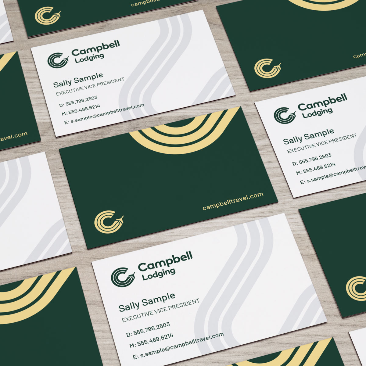
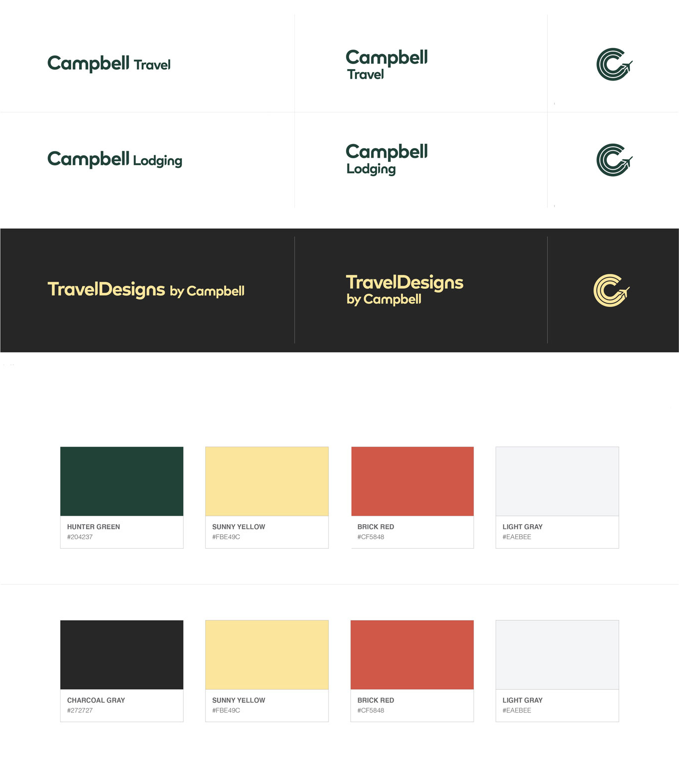
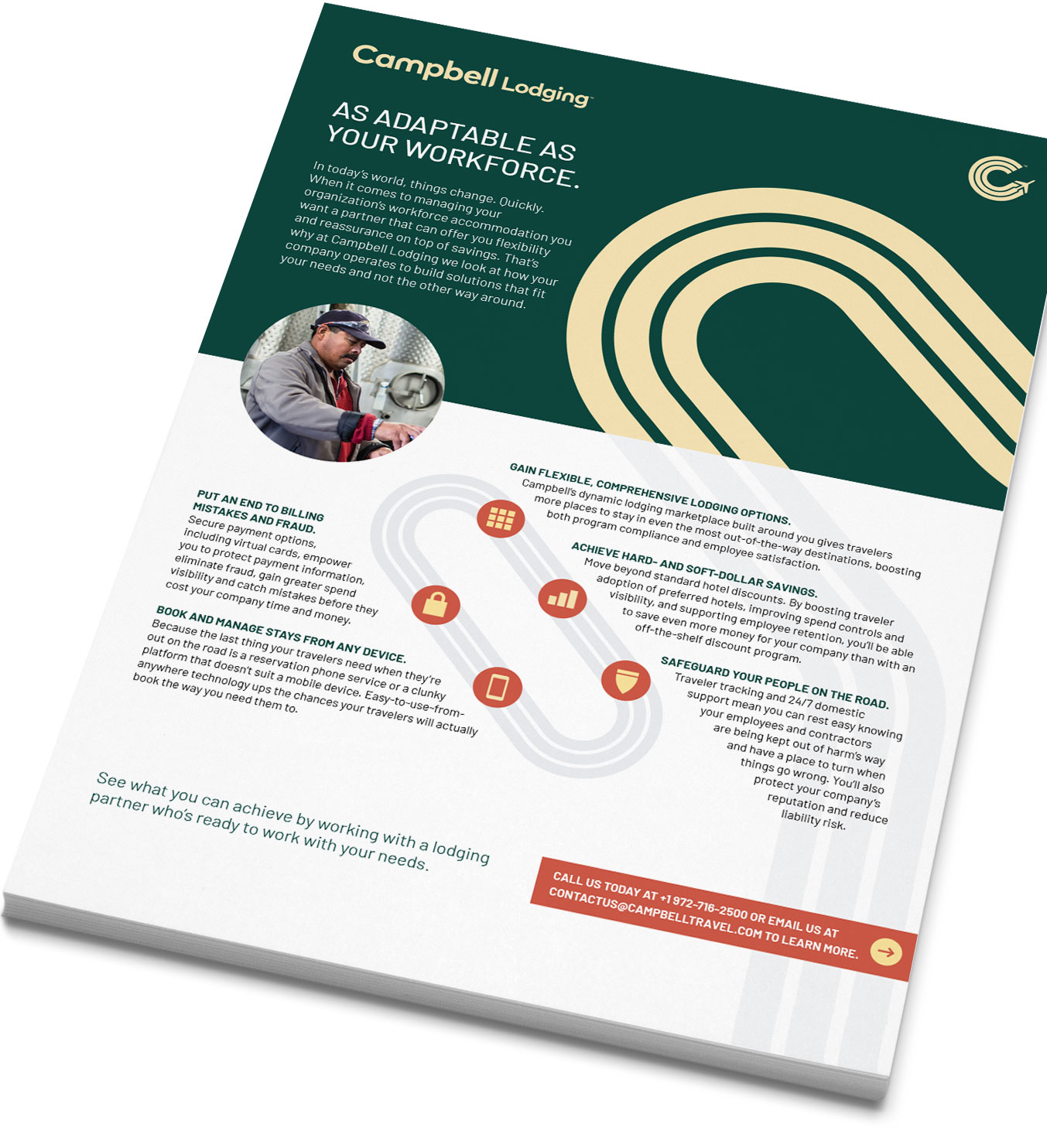
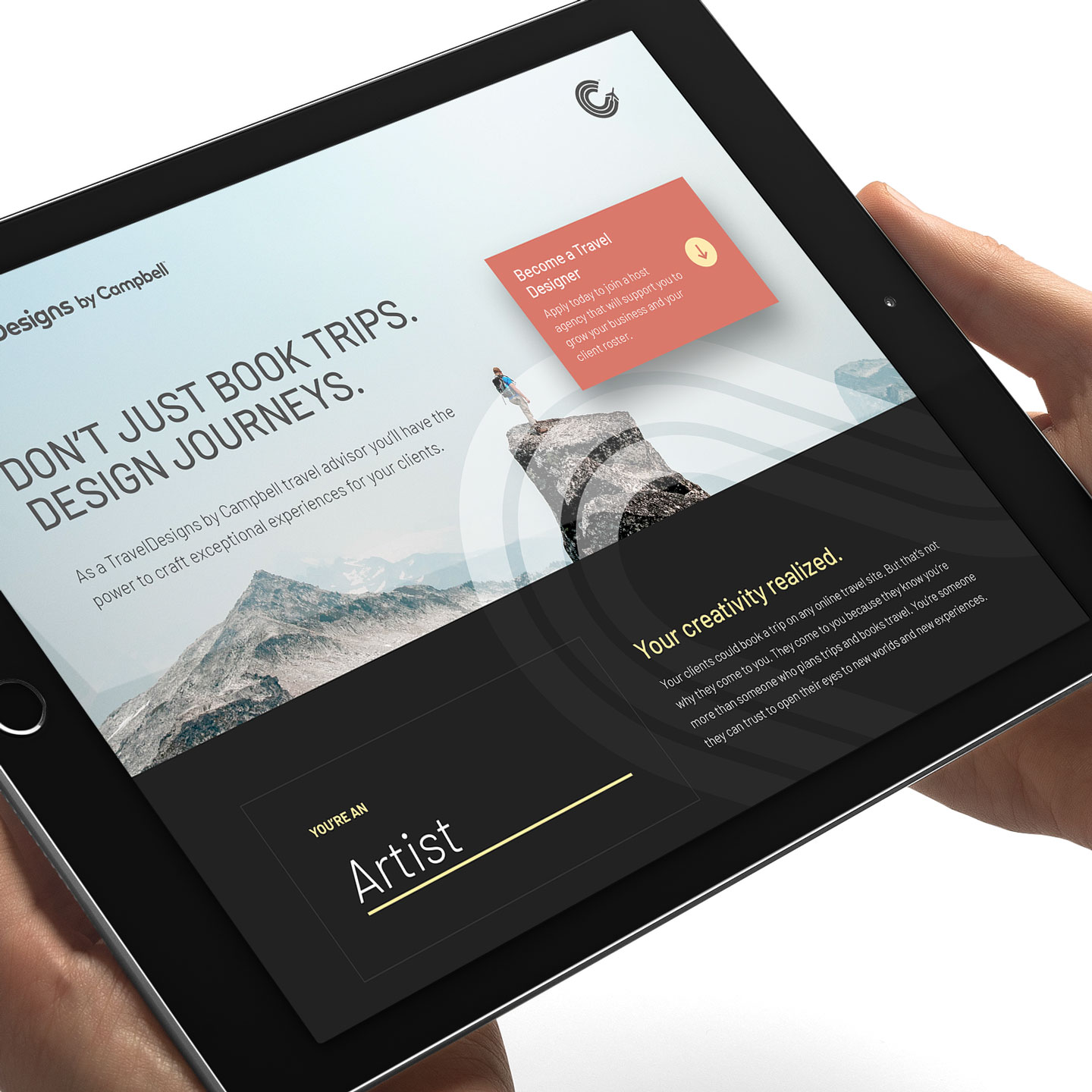
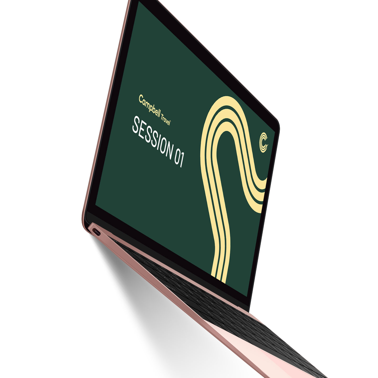
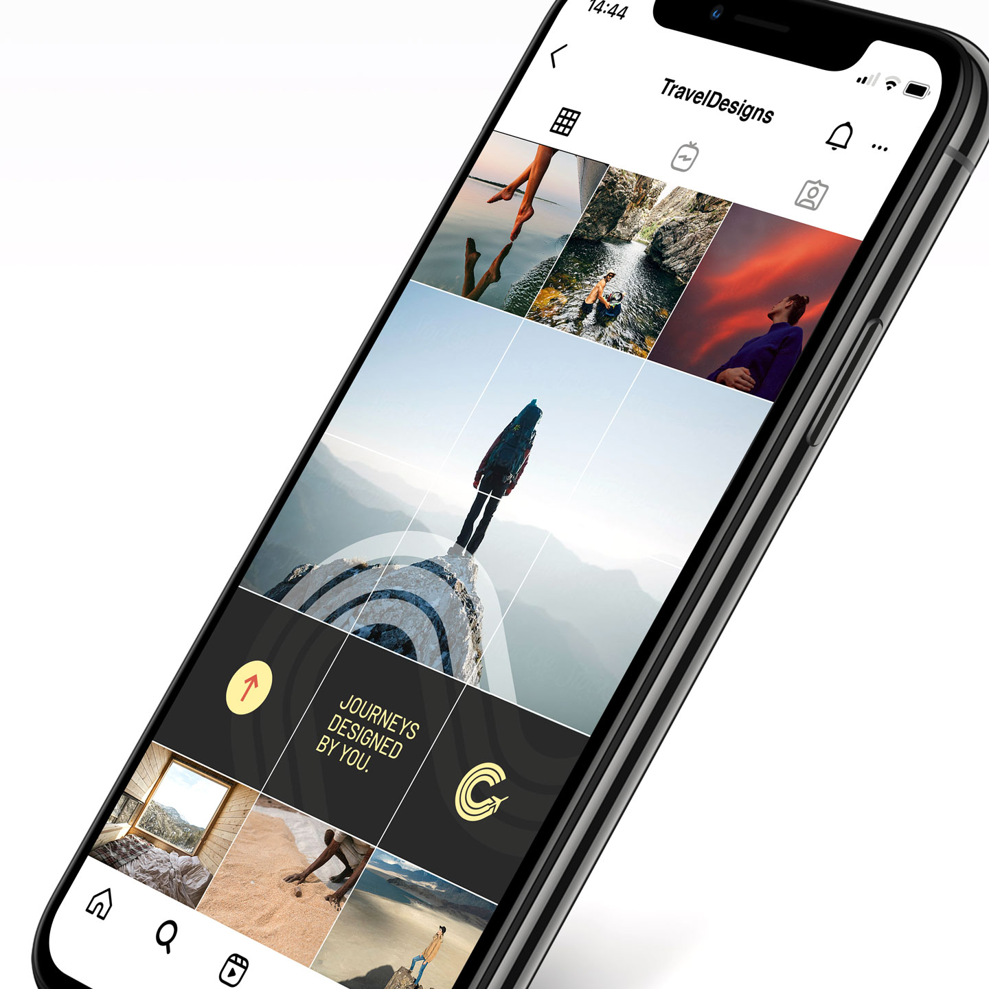
We achieved an organic brand evolution by continuing the form language introduced by Campbell’s established Airplane C. To create a contemporary and dynamic appearance, we detached the brand symbol from the logotype, developed a distinct lettering system that stands independently while leveraging the existing mark as an adjacent anchor. The Journey graphic weaves its way through the various brand touchpoints to create cohesiveness.





Distinct within its industry
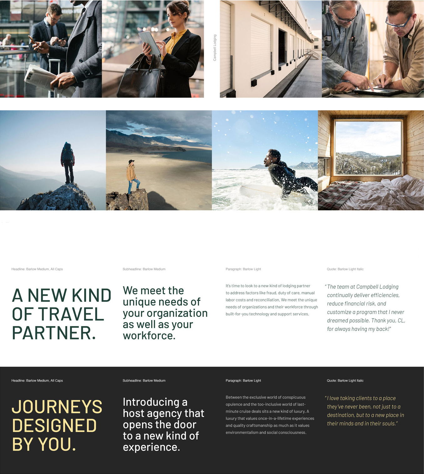
Campbell Travel’s unique color palette elevates the clean and clear presentation of information – making it stand out amongst its peers. As a whole, the design system effectively speaks to its audience(s) by projecting calm and comfort while, at the same time, conveying a future-forward attitude.
Did Campbell Travel spark your interest?

Tripbam Relaunch
Tripbam empowers travel managers with fully automated solutions for tracking and reviewing corporate travel market data.
- Year: 2021
- Agency: Dots & Lines
- Sector: Tech
Carver Pump
A centrifugal pump manufacturer with an eighty-year history – made in the USA.
- Year: 2017
- Agency: Chris Vogel Design
- Sector: Commercial & Industrial
Jeter Melder
A small yet focused legal team that solves complex challenges for clients who like to be involved.
- Year: 2015
- Agency: Chris Vogel Design
- Sector: Professional Services
