Thriveal
The disruptive sage
Simplify at every turn
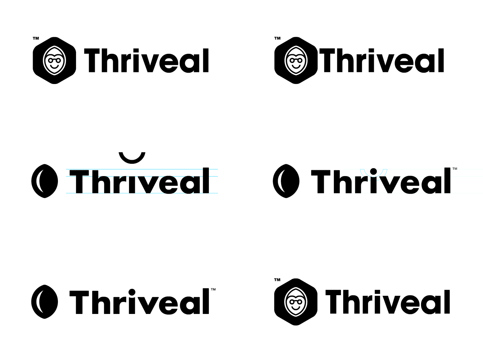
Working towards our goal of brand modernization, we revisited the original brand symbol and extracted the most meaningful and relevant aspects. We rebuilt the logotype to ensure we retained the warmth of the original logo. The resulting design is a balanced and robust logo – ready to champion a wide variety of applicational challenges.


Warm and welcoming
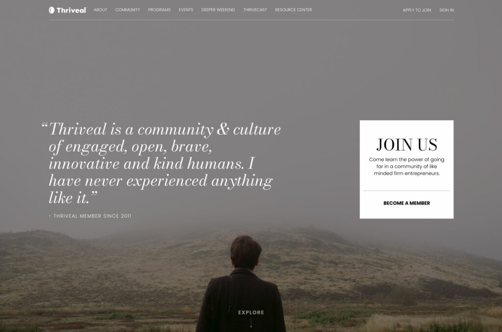
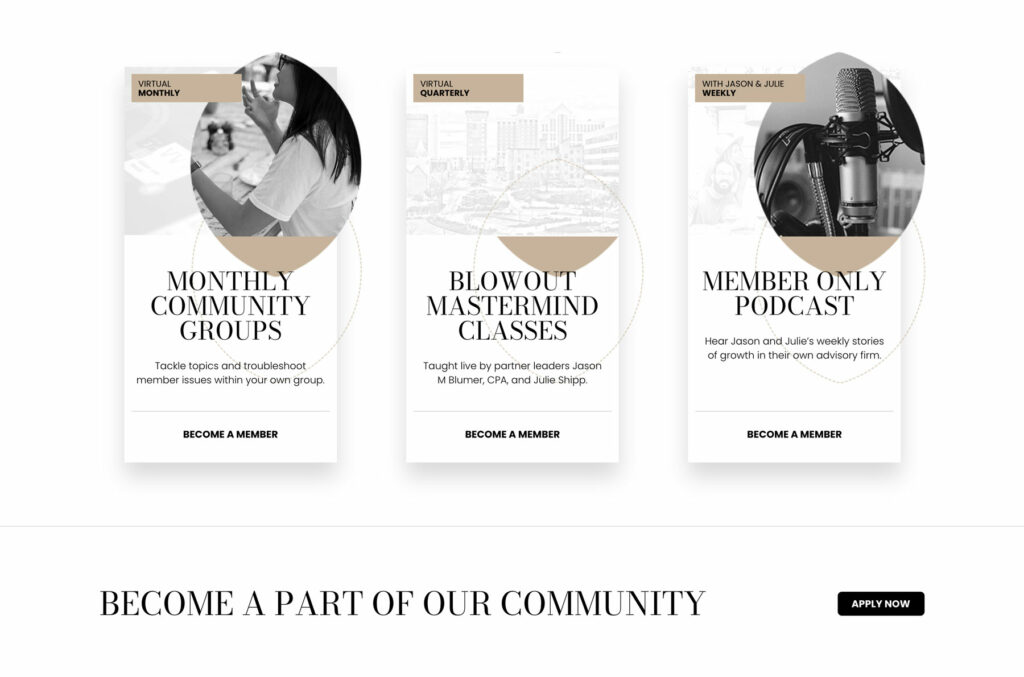
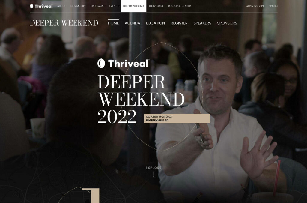
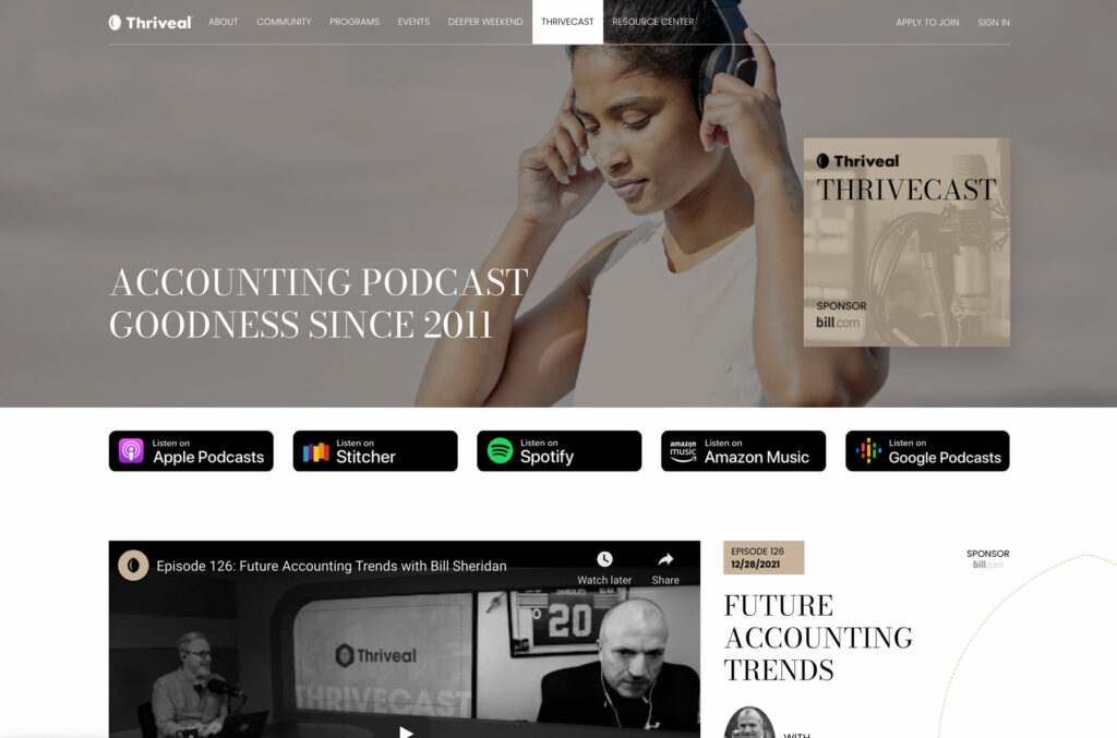
Thriveal’s new palette contains only a few colors. The primary accent color takes cues from Thirveal’s past and generates a warm and welcoming atmosphere. The remainder is limited to black and white – creating a clean and modern aesthetic with high visibility.


Typographically driven
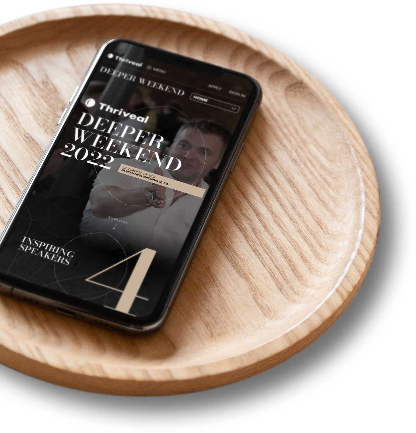
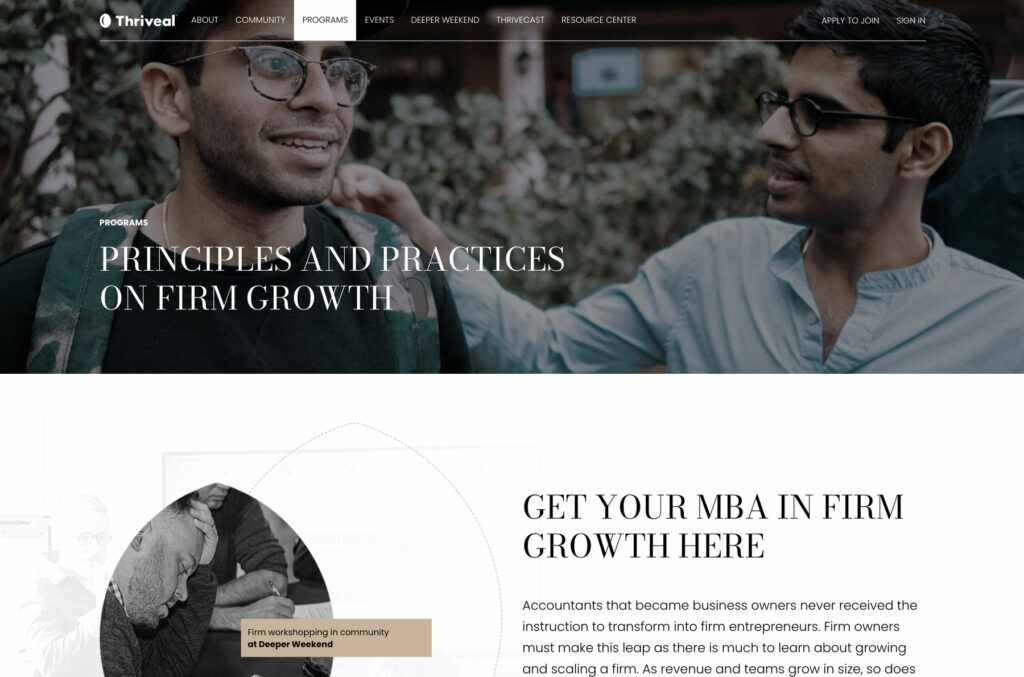
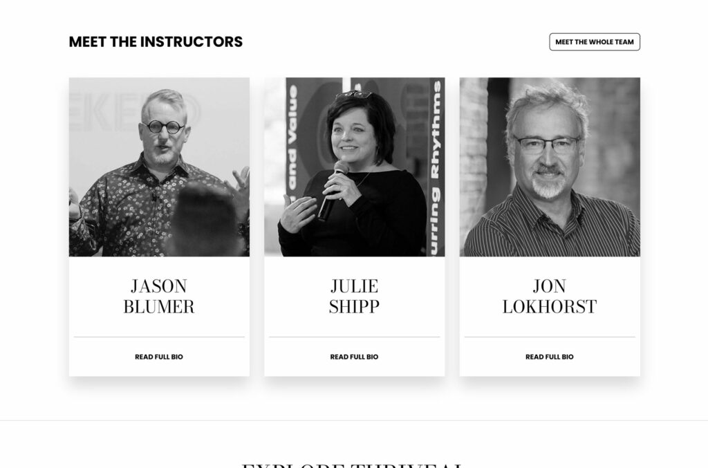
To achieve a more simplified, monolithic brand architecture, we focused our efforts on strengthening the primary Thriveal logo. Instead of creating various logos for Thriveal’s sub-entities, events and programs are treated as content elements living within a tight, standardized design ecosystem. Photography balances the past and future of Thriveal authentically. Aspirational hero images are balanced with greyscale content photography that ties back to the community’s real-world experience.


Did Thriveal spark your interest?

Pro-To-Type
An educational framework for developing and enhancing a service-based organization.
- Year: 2019
- Agency: Chris Vogel Design
- Sector: Events & Entertainment
JuiceCon
The annual conference for juicing professionals – providing revitalizing insights and actionable takeaways.
- Year: 2018
- Agency: Chris Vogel Design
- Sector: Events & Entertainment
Cry of the advisor
A visual system to portrait the process of becoming an advisor – the educational curriculum for Deeper Weekend 2018.
- Year: 2018
- Agency: Chris Vogel Design
- Sector: Events & Entertainment
